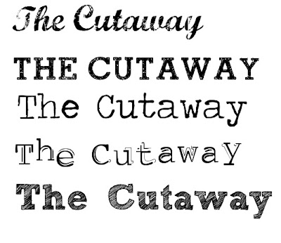
1. I like the distorted look of this font and this would fit with my 'vintage' feel images.
2. This is a very simple, yet bold font, again this is ever so slightly distorted.
3. This font, is in a style of a type writer, making it sort of uneven and quirky.
4. This font, again is like a type writer, but it has a shadow and is not completely straight, making it look more make shift.
5. The look of this font, stood out to me because of the way in which it looks like it has been hand drawn and sketched with pencil, giving it a less formal look.
Be careful with fonts, keep font simple, easy to read, well done for practising the design of your font. The first one is a bit of a non starter, 2 is a possibility and example 4.
ReplyDelete