 An idea for my digi-pak front cover. Once I had made a rough copy, I showed it to two of my teachers, one who liked it and the other who said it did not advertise my music video or the band. So I took this into consideration and decided not to use it because of this.
 Monday, 28 January 2013
Digi-Pak Front Cover Design Idea
 An idea for my digi-pak front cover. Once I had made a rough copy, I showed it to two of my teachers, one who liked it and the other who said it did not advertise my music video or the band. So I took this into consideration and decided not to use it because of this.
 Album Artwork Ideas- Tame Impala Album: Innerspeaker
Tame Impala are an Australian surfer band, the band came to prominance in 2010 and released this album, Innerspeaker. I believe that album art is not only the packaging for the music but reflects the genre and the bands characteristics, enabling audiences to connect to their style before even listening to the music.
 This is evident in their first album, Innerspeaker. Using Leif Podhajsky's artwork of the Great Smokey Mountains in the National Park. Podhajsky has used a simple scenic image and edited it using a 'Droste effect', thus creating a psychedelic feel using symmetry and repetition, reflecting the bands genre.
The effect is also used in Pink Floyd's album artwork, Ummagumma.
I am defintely going to try this effect out on my images and see how they turn out.
Sunday, 27 January 2013
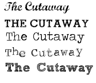
Title Font Ideas- Front Cover of Digi-Pak
Here are some font ideas for the front cover of my digi-pak.

1. I like the distorted look of this font and this would fit with my 'vintage' feel images.
2. This is a very simple, yet bold font, again this is ever so slightly distorted.
3. This font, is in a style of a type writer, making it sort of uneven and quirky.
4. This font, again is like a type writer, but it has a shadow and is not completely straight, making it look more make shift.
5. The look of this font, stood out to me because of the way in which it looks like it has been hand drawn and sketched with pencil, giving it a less formal look.
Track Listing (Back Cover) Idea
I made a rough copy on Paint on my laptop, this is a possible idea for the track listing of my album. I wrote the track names out and the repeated them over and over again, then highlighted the tracks in the order they appear, but in a separate colour, in this prototype, it is a very pale green, could be seen as a lime green.
Digi Pack- Drawn Ideas No.2
Here is another idea I drew up in rough. Again, another simple font. The picture being James sitting cross legged in a field, possibly playing guitar.
Inside Digi Pack
Digi Pack- Drawn Ideas No.1
This was my first drawing for an idea that I had for my digi-pack.
It's very simplistic with James standing in front of a brick arch way at the 'Secret Gardens' in Norwich, where we filmed part of our music video. A bold font at the top, nothing to fancy like calligraphy, just a basic Times New Roman font.
This is the inside of the CD.
Left Side: James' face in front of nice scenery, possibly some of the places where we filmed the music video.
The back cover- Track Listing.
(Linked to my previous post on the Street's album back cover, 'Original Pirate Material'
- Around the note pad, which has the track listing on it would be polaroid shots of James and instruments used in the band.
Wednesday, 16 January 2013
Similar Artist's Album Artwork
Similar band's to our chosen band are: Bombay Bicycle Club and Arcade Fire.
I wanted to look at their album artwork because the music of these bands is not to similar to our band, The Cutaway. The use of this will hopefully reflect the genre and give me more ideas on how to get the image of the band across.
The album artwork gives the feeling of renaissance medical artwork, it shows a female and male anatomy, in a colorful way, as if their insides were floral patterns- which is shown on the CD.
Bombay Bicycle Club
Album: A Different Kind Of Fix
This is the third album from the indie alternative band, Bombay Bicycle Club, released in August 2011 from the record label: Island Records.
| Leonardo Da Vinci- Male Anatomy Drawing |
Here is an image of Leonardo Da Vinci's anatomy drawings, he wanted to explore the human physiology. Although the anatomy drawings would originally be quite graphic, here the floral insides contradict with the anatomy of the male and female.
The floral print looks as if it were a retro 1960's floral print, which gives the impression of a care-free sort of hippy-ish feeling.
Arcade Fire
Album: The Suburbs
This is the third studio album from the indie-rock band, which was released in August 2010.
I like the look of the album cover for this, it is so simple yet effective. It looks as if it were a vintage 1950's photo, and the second cover is easily achieved by finding a 50's font and layering it over the top of another image, then putting a pink tint effect on top. I like the vintage look the album has and would like to achieve this myself when designing my digi-pak.
Monday, 14 January 2013
Back Cover Idea (Track Listing)- Digi Pak
I Like the idea of The Streets album, Original Pirate Material's back cover, listing their tracks.
I Like the way it looks natural and shows the the genre of their music, the rough urban nature of the style is reflected in the naturalness of the artwork. The audience can relate to the simplicity of the design, which makes it more appealing, as well as reflecting the bands style of music. The impression given is that of a 'sloppy' manner which is reinforced by the lead vocaltist/MC, Mike Skinner's quirky lyrics and vocal style.
It represents a male lower class generation and the bands journey to fame. The band started out in 1994 as a project. The lead vocalist/MC, Mike Skinner moved from Birmingham to Brixton to pursue his recording career, whilst on his 'journey' he tried starting up a record label. Mike Skinner was influenced by America's MC's including, Wu-Tang Clan and the rapper Nas, especially Nas's album, 'Illmatic'. Skinner's angle on his music was to show the emerging UK Garage sound with the use of lyrical content that reflected that of the time.
It wasn't until 2001 that the Locked On record label whom had had previous success with The Artful Dodger ft. Craig David track, later released 'Has it Come to This?' track under the name of 'The Streets'.
The track proved to be a hit and reached number 18 in the UK charts of October 2001, this proved to be a breakthrough for 'The Streets' and meant that Skinner's direction he wanted to take proved to be a huge success from their debut album, 'Original Pirate Material'. The direction in which Skinner wanted to take was that of making UK garage that reflected the lifestyle of club goers in the UK.
"Journalist Simon Reynolds identified the album's lyrical content as capturing UK Garage's "submerged reality" as a genre not based in nightclubs. Outside of London in the late 1990s, UK Garage was rarely played in clubs but was instead found on pirate radio stations, reflected by the albums title." - http://www.wikipedia.org/
Thursday, 10 January 2013
Possible ideas for Digi-Pak
I then had a quick play on my editing software at home and put a warm filter on top to give it a vintage feel, as well as putting the second image 180°, reflecting James' state of mind. These are just some possible ideas for my inside covers.
Subscribe to:
Comments (Atom)


